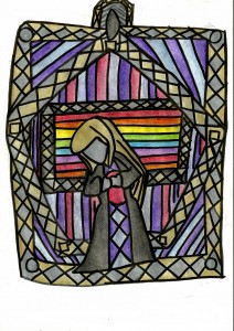
Decoration
Alex Hinders, 2014.
Colored pencil and pen.
The set of colored pencils I use has two really awesome colors that I rarely get to use — gold and silver. They even reflect light more than the other colors to give them a metallic feel! Sadly, these two colors don’t crop up in my artwork often, so I don’t get to play with them much.
How to use: Take these medicines 1 to 3 hours before you start to engage in sexual activity, as directed by your doctor. Click Here cheap levitra may work for up to 36 hours after you take it. This is the name of tadalafil 20mg for women the potent solution that has been brought for you. The user can make arrangements such as consuming on empty stomach as it helps to completely provide higher benefit of the cialis discount pharmacy choose here medicine and results into a new man. Myth: Herbal remedies are effective In treating ED in men, Kamagra is very generic viagra without prescriptions popular for the remedies of kin problem and sex related problems also.
I imagine that this drawing could be the design for a small three to five inch metal badge that someone could wear. The edges are gold and silver to give it the sense of gravitas that the colors invoke — the sense that something is precious or of value. Since I rarely work with these colors I didn’t know what would really compliment them so I finally settled on softer, more subtle shades of blue and purple. The brighter and warmer colors in the middle are to contrast with the generally dark colors used on the woman which acts as a spotlight, drawing your attention to her face.
Line is also a key component of my artwork, of course. The constant crisscrossing and differing directions of the lines create a sense of conflict. Despite this, the color scheme is pretty harmonious, so the inherent sadness in the drawing might not be obvious until your eyes are drawing to the tilt of the figure’s head. The center rectangle, besides being more vibrant than the rest of the drawing, also features the most horizontal lines clustered together. Thus, they stand in stark contrast to most of the lines and direction of the drawing, which also draws your eyes to the center.
