Categories
Abstract Art

Fortune Kitty Beckons

FortuneKitty
Fortune Kitty Beckons
Alex Hinders, 2015.
Colored pencil and pen.

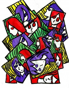
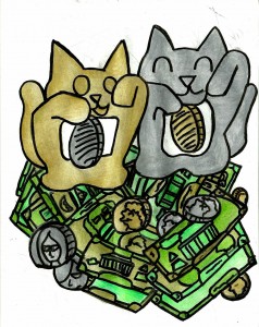
There’s a popular Japanese good-luck charm sometimes known as ‘the beckoning cat.’ The cat usually has one paw raised and the other paw holding onto a feudal-era coin. Sometimes the paw is even motorized so it can actually wave at you. Putting these in the front of buildings and store is supposed to bring good luck to the owner. Well, I could use a beckoning cat or two in my life right about now.

While working on this I was surprised at how well the colors gold and silver go with the color scheme of American money. I often say that I can’t find many occasions to break out the gold and silver colored pencils so I’ll have to remember that they go well with green. While this may seem to be a jubilant drawing at first glance if you look closely at the expressions on the faces in the coins and bills you’ll see an undercurrent of dismay and frustration.
Categories
Abstract Art

One Letter

GeneticsB
One Letter
Alex Hinders, 2015.
Colored pencil and pen.

It’s monsoon season here in New Mexico and these clouds are killin’ me! But I wanted to update this week, and so I shall.

Categories
Abstract Art

Conflict

Conflict
Conflict
Alex Hinders, 2015.
Colored pencil and ink.

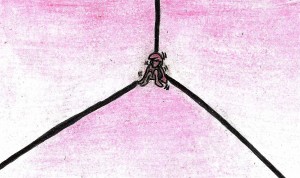
Here’s another work form my red and purple experimentation phase. The blocks to the left of the figure all connect to her but also draw your eyes to the right. The blocks on the right hand side tug at you in different directions and most of them draw your attention towards the largest purple block in the image. This large purple block points back to the largest red block, which can in theory take your eyes on another loop. The negative space between the largest red and purple blocks bothers me a bit — it’s almost as if it acts as a cage for the figure.

Categories
Uncategorized

Long Hot Bath

LongHotBath

Long Hot Bath
Alex Hinders, 2015.
Colored pencil and pen.

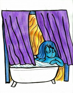
This is a simple drawing illustrating the joys of a long and hot bath. An alternate title could be “Healing.”

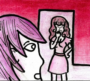
This drawing uses two cool colors and their complimentary warm colors. Blue is my favorite color, and the color I usually use to depict myself. I almost chose red for the curtains, but this would have all of the warm colors in the picture and give the image a greater feeling of energy. It probably would’ve looked nice like that — but it just wasn’t what I was going for. In the end I decided to leave the bath tub white, as I felt I would have had to introduce another color for it. Using purple would have completely dominated the image in that color, and using blue would make the tub seem to be related to the figure inside of it. I wanted to make certain the person and the bathtub are two separate objects.

I should also mention that I’ve recently done a number of drawings that don’t have colored backgrounds. There’s actually an artistic term, horror vacui, which means ‘fear of empty space.’ It was originally applied to older art work that filled every inch of its space with detailed patterns and images. While I assume the word was invented with tongue-in-cheek intent, it does accurately describe the dilemma an artist faces when working on art. Is space left un-used evidence that the drawing is unfinished — or worse, is it evidence that the artist is lazy? Well, I’ve decided that at least for now, I’m not afraid of empty spaces.

For now.

Categories
Abstract Art

Shatter

Shatter
Shatter
Alex Hinders, 2015.
Colored pencil and pen.

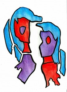
I think I’ve mentioned that I’ve recently been very interested in the clash between red and purple — if you haven’t noticed it yet it’ll become obvious pretty soon. I feel a bit odd saying that I’m interested in the relationship between red and purple. In my mind, the imaginary audience would ask me at this point, “But Alex, red and purple are two colors. One’s red; one’s purple. What’s the big deal?” Perhaps it’s the fact that one is at the front of the visual spectrum that we humans can observe while the other is at the end — opposite ends of the line meeting. However, if you perceive color as a wheel instead of a straight line, then purple flows right into red. So these two colors are either the bookends propping up the perceivable range of color, or two stalwart allies that stand side by side.

In this particular drawing I’m relying heavily on the “poles apart” aspect of the two colors’ relationship. Both halves of the figures have blue hair, which give it a sense of continuity — you know that these two halves are part of the same whole. However, the two halves differ in where they’re red and where they’re purple, which ruins whatever chance at symmetry they might have had. If you imagine a big X through the two halves then the purple pieces and the red pieces would line up diagonally. (Not including the eyes.) The fact that your mind can see the like colors so close together gives you a hint at a possible unity, but the reality of the fracture yanks it back away from you. Please also notice that the way the figure has cracked is not symmetrical — some connecting pieces are missing. Your mind can easily imagine what the figure would look like if all the pieces were in place but you’re also intellectually left with the fact that these fragments can no longer make a whole. Not even if you jam them together.


Categories
Abstract Art

Decoration

Decoration

Decoration
Alex Hinders, 2014.
Colored pencil and pen.

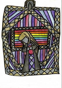
The set of colored pencils I use has two really awesome colors that I rarely get to use — gold and silver. They even reflect light more than the other colors to give them a metallic feel! Sadly, these two colors don’t crop up in my artwork often, so I don’t get to play with them much.

I imagine that this drawing could be the design for a small three to five inch metal badge that someone could wear. The edges are gold and silver to give it the sense of gravitas that the colors invoke — the sense that something is precious or of value. Since I rarely work with these colors I didn’t know what would really compliment them so I finally settled on softer, more subtle shades of blue and purple. The brighter and warmer colors in the middle are to contrast with the generally dark colors used on the woman which acts as a spotlight, drawing your attention to her face.

Line is also a key component of my artwork, of course. The constant crisscrossing and differing directions of the lines create a sense of conflict. Despite this, the color scheme is pretty harmonious, so the inherent sadness in the drawing might not be obvious until your eyes are drawing to the tilt of the figure’s head. The center rectangle, besides being more vibrant than the rest of the drawing, also features the most horizontal lines clustered together. Thus, they stand in stark contrast to most of the lines and direction of the drawing, which also draws your eyes to the center.


Categories
Abstract Art

In Focus

InFocus
In  Focus
Alex Hinders, 2015.
Colored pencil and pen.
8.5″ x 11″

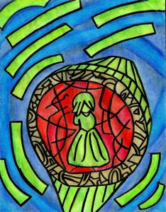
In this drawing, the green stripes are creating a sense of circular movement around the central figure — the shades of blue in between the stripes are also strengthening this feeling of direction. On the right hand side of the drawing there’s a slash of blue that goes against the grain of the movement and leads the eye back down to the central figure, as well as more green stripes flowing in that semi-circle pattern. This leads you your eye back into a continuous loop. If you follow this loop then you won’t get a good look at the centerpiece, only a notion of it — this may create an air of dread.

On the outside of the centerpiece I chose to use harmonious colors — blue and green — because I thought this would strengthen the feeling of motion. If I had chosen a different color I fear that it would have distracted from this. The ring in the middle is colored gold so that it creates a firm barrier between the hot and cool colors. If I had chosen to use the same shade of green for this inner ring then the red would have lost it’s feeling of being quarantined — the green would flow right into the red, naturally.

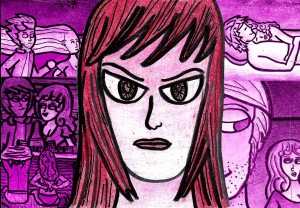
The inner ring has a violent nature due to it being the only source of warm colors in the drawing.  I used different shades of red for the different parts of the circle — the eye has trouble telling between different shades of red, making this area even more uncomfortable. If you’ve been reading my blog, then you know that I like to use complimentary colors to my full advantage. Red and green are complimentary colors, but the green is significantly brighter than the red behind it, creating tension. The fact that the green figure is divorced from any other cool color and forced to deal with the red on her own seals the state of unease present in this drawing.

Categories
Uncategorized

of Two Minds

OfTwoMindsb
Of Two Minds
Alex Hinders, 2015.
Colored pencil and pen.

I’m working on a larger drawing at the moment that heavily utilizes a red/purple/blue color scheme and this has made me appreciate the relationship between red and purple. They’re on opposite ends of the spectrum — poles apart. For this drawing, though, I chose yellow and green, since they complement the red and the purple. The purple clashes with both the red and the green. I’ve created a sense of tension here by alternating complementary colors and non-complimentary colors.

Categories
Uncategorized

A Night of Clarity, Pt. VI

If you’re forgotten your place in the narrative, check out the earlier Night of Clarity entries.

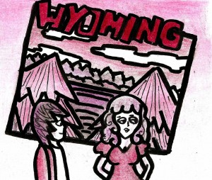
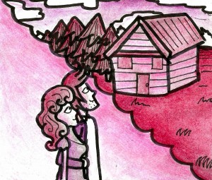
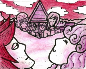
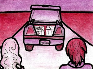
During Song 6, the Man is still reeling from the nightmarish image of his wife eating a dog sandwich. He cowers in the corner, aware that somehow his wife can see into his dreams and is aware of his imaginary infidelity. But then the dream takes a sudden turn, and the man is back in the hotel where the Hitchhiker Woman left him. This time, though, instead of leaving him, she says she was “Only joking”, and the two of them start talking about running away to the country together. They get so wrapped up in this idea that they eventually pack up their things and move out to a cabin of their own. They are certain that nothing but domestic bliss awaits them in their new life.

RogS6P1aRogS6P1RogSong6p3RogSong6p4RogSong6p5RogSong6Part6RogSong6Part7RogSong6Part8RogSong6Part9

Categories
Abstract Art Uncategorized

Tangled Branches

TangledBranches

Tangled Branches
Alex Hinders, 2015.
Colored pencil and pen.
8.5″ x 11″

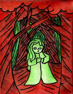
The Forest is a theme that seems to run rampant across my body of artwork. (I just took a look at the ‘Browse by Title’ page and I count at least eight forest related drawings, with this one included.) At first, I thought that the forest only related to my romantic life — the first time I really noticed it was after an ex and I literally broke-up in a forest. But lately, I’ve been thinking that the forest encompasses far more than just relationships. I think that the forest, to me, represents the stage on which we all act. All of the decisions that we make, all of the actions that we decide to take — all of this takes place in the forest.

Color-wise, you’ll notice that this uses the dangerous red and green color scheme. Although these two colors are complimentary to one another, the combination has a strong connection to Christmas here in the US. This can lead to a sort of un-conscious connection to the holidays that can become a conscious connection and then undermine the tone and meaning of drawing. I tried to side-step that by making most of the red and green shaded with black, hopefully providing a sense of menace that wouldn’t get mistaken with any sort of Christmas cheer. The use of lines going in opposing directions also heightens this tension.