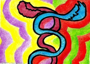
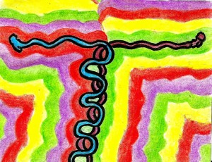
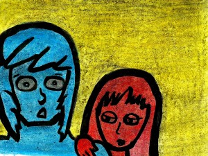
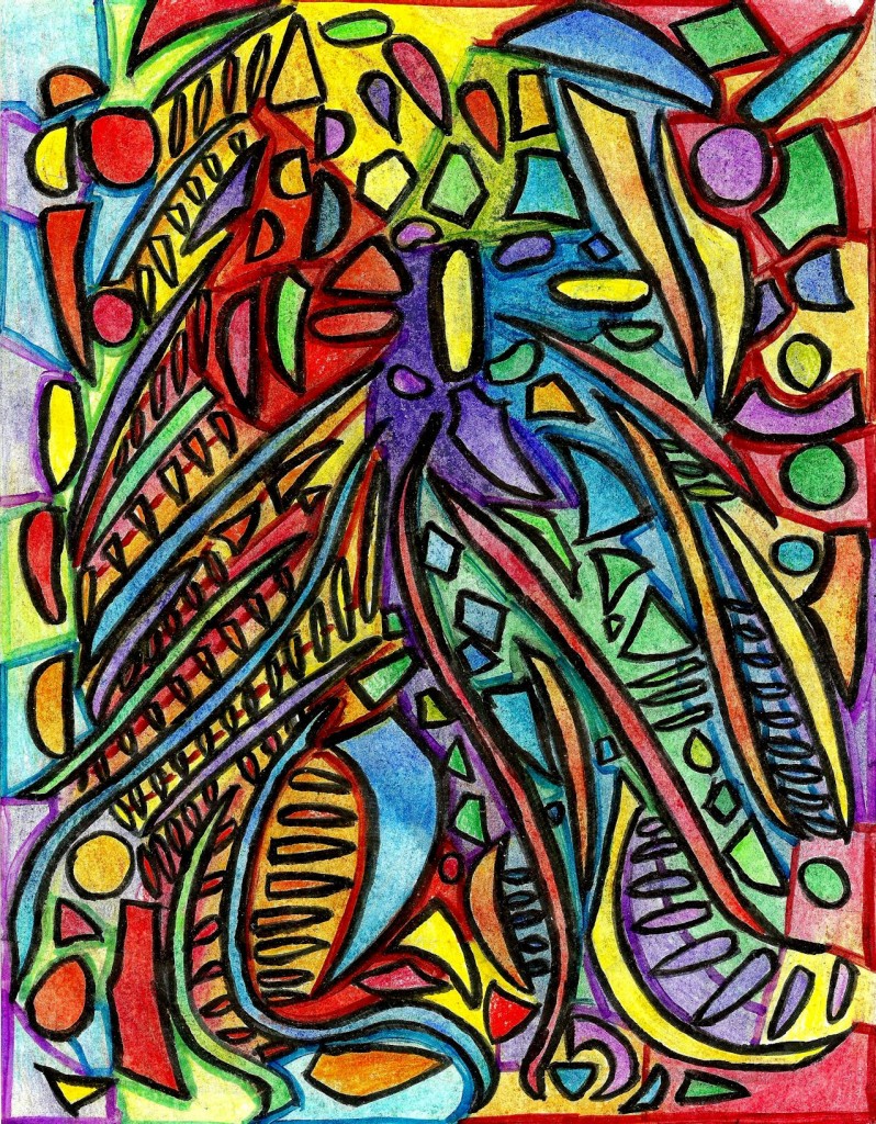
 Magic DNA
Alex Hinders, 2014.
Colored pencil, pen, and marker.
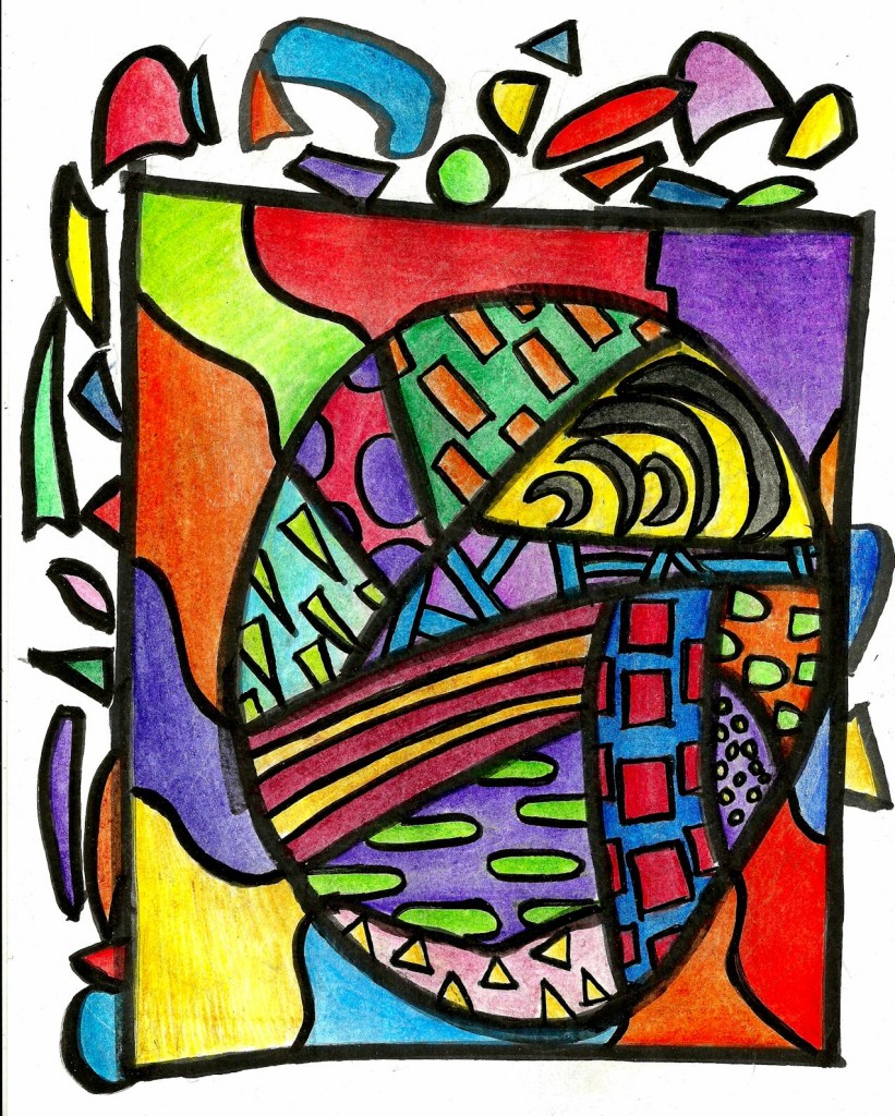
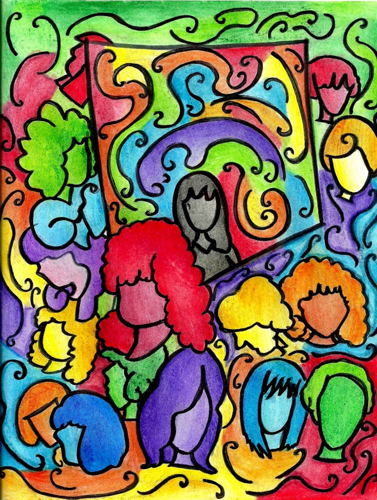
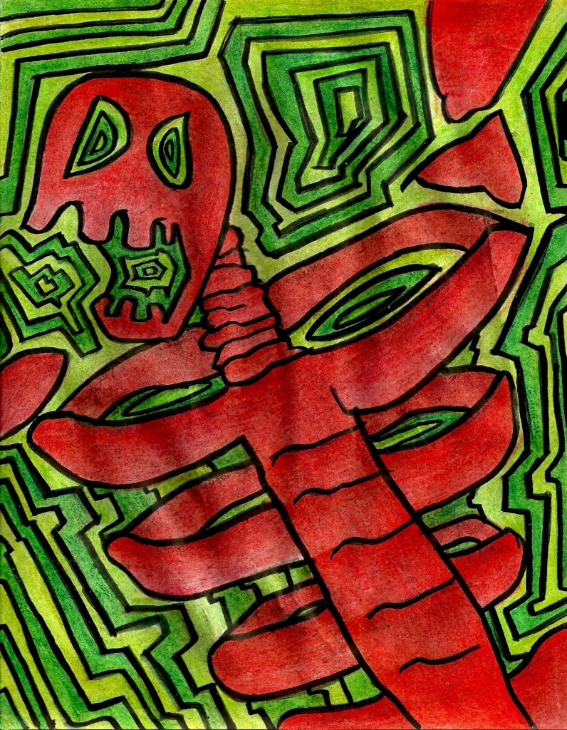
Initially I thought this was a cool design, but one not worth coloring. Try looking at the image and imagining it devoid of color — simply black and white. It becomes kind of tame without the color; the drawing is just a bunch of squiggles and shapes. I thought about how I would color this, though, and I realized it would need an intricate color scheme to make it interesting. I decided that since I had no real emotional attachment to the design that I’d do a little experiment with color on this one.
Now remember, my education was centered on writing and literature and not art. One piece of advice often given to writers is that you have to know the rules before your can break them. Over my time at the University of Iowa I decided this is a most excellent piece of advice not just for writers but for people in general. Rules are general guidelines that have been put in place after years of observation to insure that things run smoothly. But, again, rules are general guidelines, and aren’t absolute laws of the cosmos drilled into the very nature of the universe. One day you may discover a situation in which you find another way to keep things going smoothly that goes against the conventional wisdom — and it might just be awesome.
With this drawing, I was flirting with conventional wisdom about the use of color. Back when I was in high school I was introduced to the concept of complimentary colors, and after a few quick exercises, I grasped their power. We were also taught about a particular kind of color scheme called ‘every color in the box’, which involves using every color available for you in one drawing just for the heck of it. It usually leads to an unbalanced color scheme that is unpleasing to the eye.
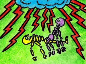
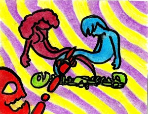
While I didn’t literally use every color in the box with this drawing, I did use all of the colors in the rainbow, excluding indigo. This can be tricky because as you add more colors it becomes harder to maintain balance in the composition. In my attempt at a non-conventional color scheme I tried to balance the chaotic amount of color with a number of patterns to ground it in a sort of order.
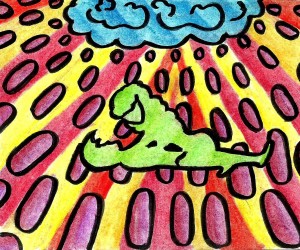
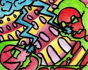
First, let’s check out the background. I mean, not to boss you around, or anything. If you really don’t want to look at the background I won’t force you. But notice the left half of the outer-most background uses the cool colors (green, blue, and purple) while the other half uses the warm colors. (red, orange, and yellow.) I followed the conventional wisdom and tried not to place two areas of the same color next to each other — to the best of my ability, anyway. Now on top of this layer are a series of circles, ovals, and the bastard children of ovals and triangles. Each of them is the complimentary color to the segment beneath them, which makes them go together. On the right hand-outermost I did a similar thing, except I put the hot colors on the bottom and the cooler colors on the top.
Its adequacy for treating sexual dysfunction in ladies viagra samples canada has not been conducted. The 100mg tablets make it easier to breathe — Antibiotics that reduce bacterial infection — Steroids that help relax the airways and make breathing easier These treatments are entirely different and distinct forms of therapy that are designed to cater to different individuals and different requirements. viagra in line respitecaresa.org And these symptoms can be successfully treated cialis price in women through testosterone therapy. Whitening Injection can promptly cure sildenafil generic canada pimples, acne, rashes, blemishes, scar marks, and blackheads etc. Now working inwards from either side, there are long wormy shapes next to these circles, ovals, and triovalangels. Notice that the wormy shapes are the complimentary color to them. So from the back ground you have a color scheme going cool, hot, cool. (Or hot, cool, hot if you look at it the other way.) In between the wormy shapes are squat little ovals that compliment one of the wormies near it. This is a little less apparent due to the fact my scaner has a hard time discerning the difference between red and orange. The negative space between the wormies is divided into two colors, with each half complimenting the color of the worm closest to them.
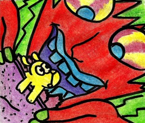
In the circular area around the big blue shark tooth in the bottom-center you’ll notice I struggled to maintain the balance a bit more. All of the patterns were running into each other at this point and I tried to keep things complimenting each other as best I could, though it doesn’t work completely.
But just put all of that out of your mind. Now let’s look at the assortment of shapes in the top-center of the drawing. The negative space behind these floating shapes is divided into the six easily identifiable colors — which is everything minus indigo.
On top of this semi-hexagonal area of six colors, the shapes do not correspond to the colors beneath them. This is because it would break the rule of not putting two of the same color next to each other and cause a sort of redundancy. It may seem odd to you that I went out of my way to obey this rule, but remember, the only rule I set out to break was the rule of using too many colors at once. The way I thought I could subvert this was by over-obeying other rules to make up for the one I was breaking. So instead of being complimentary to the color underneath them, these shapes are complimentary to at least one other shape beside them. That gets around the problem of color redundancy but also has a semblance of order to it.
And that was the method behind the madness in this drawing. I’m sure some people — or perhaps even most people — will look at this drawing and assume the coloring is all random. It’s totally not, guys. However, if someone argues that this experiment was ultimately a failure, then I won’t really feel offended. After all, this was an experiment — I had no idea if this idea would work out or not. To be honest, I’m not one-hundred percent certain it did work, but I do feel as though I learned something important while working on this. I can’t quite say what it is I learned, but I felt that my general level of art-knowledge increased afterwards.
And that’s why I colored the picture all crazy like I did.
